As designers we know that the products or services we design need to be accessible for people using them. And we know that making things accessible makes them better for everyone. But we don’t always consider how the internal tools and outputs we create need to be accessible too. Not only does this ensure everyone in your team can participate, but it also means that your artefacts are more likely to help you achieve what you want to achieve.
Mapping is an important tool for service designers, but we can often create complicated, inaccessible maps. In this blog post I will outline why it is important that your maps are accessible and how this will help you. Then, I will give some tips about how to make your maps more accessible. This can be hard, but maps do not always need to look pretty or cool to do the hard work to make it simple.
There’s lots of different types of maps you can create, for example journey maps, service blueprints and service maps. In this post I will talk about some general principles that you can apply to all of them.
Why your journey map, service map, or blueprint needs to be accessible
Your map needs to be able to be used by everyone
When we create journey maps we’re creating them to influence someone or decide something. For example, we use them to make decisions, show what works and what doesn’t work in a service, or show the scope of the service.
If a map is not accessible then you are limiting the pool of people who can make decisions or engage in it, you are excluding people and limiting the perspectives you can get on your work.
It’s important to remember that people experience barriers for various reasons. These reasons can be very personal and people should not have to disclose a disability, impairment, or accessibility need. So, if you assume that nobody has an accessibility need, it’s very likely you are excluding people. You also don’t know what needs those people who may join your team in future may have.
It helps you achieve what you want to achieve from it
If you make your journey map accessible then it is most likely to be simpler to engage with. If you want someone to make a decision based on what a map is showing, or highlight parts of the journey that are not working, you’re more likely to be able to do this if the map is clear and simple. This means you have to do less explaining and that people can focus on the questions and points you want them to focus on, not navigating or understanding the map itself.
It will also help time-poor senior stakeholders use it, the kind of people who only have time to skim read everything and are context switching.
There’s also a lot of value to be had from people who are not a digital specialist or someone not in your immediate team seeing the map and engaging with it. Whilst tools like Mural don’t require digital expertise to use, they can still be confusing and overwhelming.
So that it lives on regardless of technology, and even if you are not there to explain it
When we’re working remotely it’s easier to be less purposeful about what you create. There isn’t a fixed amount of wall space, so you can keep on producing stuff. This can offer lots of opportunities but, it also means we can leave a litter of stuff behind.
The most simple tools for creating journey maps are the tools we are most likely to keep for a while, for example Google Sheets. They will evolve with technology and won't get overtaken by other tools. You never know when your department might need to reprioritse funding for an application like Mural, or it will get acquired into another tool which you can’t afford.
It’s better for the planet
The internet produces electricity. When we’re doing stuff online it has a carbon footprint. It’s stored in data centres which are powered by huge amounts of energy. The devices we use to access it need charging. In general the more complicated the thing, the more carbon it produces. The more space it takes up and the more power it needs to run. Make it simple and things might be a little bit better for the planet. As Gerry McGovern says, “[data production has a] wholly unsustainable growth rate and it will have cataclysmic impacts on the environment if it is not radically reduced”.
How to create an accessible online journey map
Here I am assuming you have some understanding of how to create maps in general. If you don’t, read this blog post which tells you the steps to make a service map.
The common ways maps are not accessible
The common ways I see maps not being accessible are:
- They are made in inaccessible software - for example made using whiteboard software which usually does not meet WCAG standards
- They’re too big and overstimulating - for example, they’re covering too many things, which makes them really hard for some people who are neurodiverse or with cognitive impairments to take in
- They might have too many rows or things in too many directions, which makes it hard for people to navigate, for example people with motor impairments. If there are too many boxes or things to tab through it’s really hard for people with visual impairments
- They have too many colours, icons, and arrows - this can add to overstimulation, but also things that rely on colour for explanation cannot be used by people with visual impairments
Do you even need a map?
Before you jump in to creating a map, think about why you need it in the first place. As designers we often jump into creating things. Creating artefacts can help us feel like we’re producing helpful things. Vicky Houghton Price has written a whole blog post about this.
But before you jump in think about:
- What are you trying to show/get an answer to?
- How could you show that?
- Who is it for, and what are their needs?
Use accessible software
Start by using software that is accessible. I sometimes use Google Sheets or Excel, but that is still pretty clunky. You can use Mural if you have an accessible template, although it still might not be fully accessible. You can use a wall too, but you’re likely to need to digitise it, and you’ll need to make sure everything is big enough for people to read. Check the accessibility statement of the software you are using, and whether it meets WCAG requirements.
Break down the map
Think about what you really want to show and what questions you are answering through the map. Focus on showing just that thing.
If there are rows or swimlanes which don't help you to show that thing then take them out! You might want to make a totally different map which shows them instead.
As our design principles state, it’s all about worth doing the hard work to make it simple. This will reduce clutter and make your map simpler to understand and use.
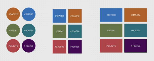
Use an accessible colour palette and keep things simple
Use colours which have a high contrast to the text. Keep them muted. Make sure colour isn’t the only way to identify a theme or set of ideas.
Try and keep things in straight lines, and reduce the need for lots of arrows or other information. This can get confusing.
Try to keep it so that the map fits on one screen, and people only need to scroll from left to right, not up and down as well.
Caption: This is an example of a more muted colour palette which has 'good' contrast. These colours are less overwhelming if you have many of them next to each other, like in a map. You can also use different shades of grey or one colour
Try it out, and keep us updated!
Some things might work for you, other things you might do differently or find a better way for. We’re keen to start a conversation about this and hear how you make your artefacts accessible in the comments.
Recent Comments