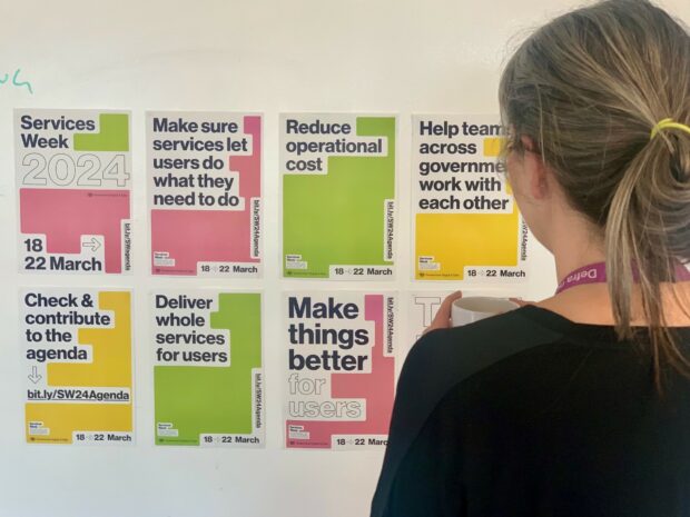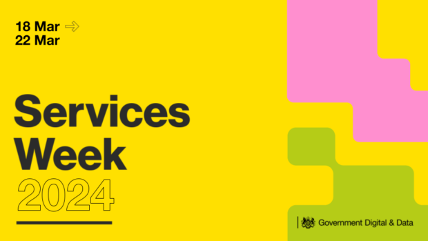
Services Week is back 17 March to 21 March 2025 and the theme for 2025 is people-centred services. Designing effective public services starts with innovation, a strong understanding of what people need from services, and close collaboration between different teams and specialisms. Are you a digital and data professional in the public sector? Services Week is an opportunity to share, to learn and to collaborate, all with the aim of transforming lives through high quality, technology-powered services.
If you want to add a session to this year’s Services Week complete the form below by the extended deadline of 10 March. You can also see how the agenda shapes up below.
What is Services Week?
Services Week is a yearly event hosted by the Government Digital and Data community with the aim of bringing the public sector together to share best practice and learn from others, improving public services. You can read more about Services Week here.
Why take part?
Services Week is an opportunity to showcase your work to people from across the public sector. It's an especially exciting time to be involved, as we celebrate the launch of the new digital centre of government, which has been set up to lead work that’s more than just a change – it will help catalyse a wholesale reshaping of the public sector, reaching out to local government, the NHS, and the private sector too. Last year’s event attracted over 5,000 attendees across the week from across 60 sessions and Services Week 2025 aims to be bigger and better than ever.
Services Week is a fantastic opportunity to:
- share your experiences and best practices, sessions vary from 20 minute lightening talks to deep dives and demos
- increase awareness of your teams work (and get feedback for development)
- gain insights about what’s going across the public sector, how are others using emerging technology, how are new public services being designed?
- grow your own network, meet counterparts in other organisations or meet new colleagues in other disciplines
- And finally, stay updated with the latest service design trends.
How to get involved
If you're interested in hosting a session at this year’s event please complete the session submission form by 10 March. The form allows you to outline your proposed session ready for publication in the live agenda below. It's a great opportunity to showcase your knowledge, connect with a wider audience, and be part of the ongoing conversation about improving service delivery. Be sure to submit your proposal early to maximise sign ups for your session!
A slide deck template for Services Week 2025 is available for use if you are hosting sessions.
You can also join our cross-government Slack channel for all the latest information and resources.
If you have any questions please get in touch with the team.
Live agenda
Monday, 17 March
9:00 - 9:25
Why your service needs a sustainability statement, hosted by DWP
9:30 - 10:30
Maps in Services: co-designing sector-wide principles, hosted by GDS
10:00 - 12:00 (Monday, Tuesday, Wednesday and Thursday)
Introduction to Service Design (AM), hosted by HMRC. (This event runs over the course of four days and you will need attend every session)
10:00 - 11:00
Services Week opening session with design leaders, hosted by Cross-government design leadership group
11:00 - 11:30
Taking the stress out of Service Assessments, hosted by GDS
11:00
Companies House Service Design patterns and User Research, hosted by Companies House
12:00 - 13:00
Capability Framework - what is it and why should you use it? Hosted by GDS - Capability and Workforce Division
13:00 - 13:25
Principles for the design of 'greener' government services, hosted by Defra
13:30 - 14:00
Mapping your public service with Pobl Group, hosted by Centre for Digital Public Services
14:00 - 15:00
Adventures in the Capability Framework: Realigning and redefining the product manager and service owner roles, hosted by GDS
14:00 - 14:30
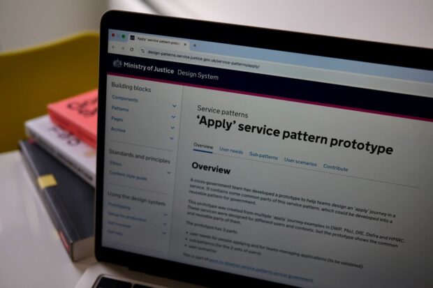
Service patterns across government, hosted by Ministry of Justice, DWP, and Defra
15:00
DCMS Show & Tell | Bridging the gap between policy and digital: Developing a registration service for short-term rental properties, hosted by Department for Culture, Media and Sport (DCMS)
15:00 - 15:25
What you need to know to present in an accessible and inclusive way (a Services Week 2025 lightning talk), hosted by NHS England
15:00 - 15:30
Designing effective delivery teams, hosted by ICS Digital
15:15 - 16:00
Blueprinting the future of Digital Screening, hosted by Digital Prevention Services | NHS England
Tuesday, 18 March
9:00 - 9:25
Introductory Courses to GDD Roles - CDDO and FutureLearn, hosted by CDDO and NHS England
9:15 - 10:00
A service design approach to building a community-owned resource, hosted by Government Digital Service (GDS)
9:30 - 10:30
Maps in Services: co-designing sector-wide principles, hosted by GDS
10:00 - 10:30
Learnings and challenges of building a design system for local government, hosted by Westminster City Council
11:00 - 11:30
Breaking legacy technology - The Green Deal Register, hosted by ICS Digital
12:00 - 13:00
Capability Framework - what is it and why should you use it?, hosted by GDS
12:00 - 12:45
Embracing Secure by Design in digital delivery, hosted by GDS, HM Land Registry and Home Office
12:00 - 13:00
Accelerating user-centred approaches to policy making in MHCLG
13:00 - 13:25
Designing for people who’ve experienced domestic abuse, hosted by Ministry of Justice
13:00 - 13:30
How we're using AI to complement our work across services, hosted by ICS Digital
13:30 - 14:00
Lessons learned from Winter Fuel: What to do when your service becomes front page news, hosted by DWP
14:00 - 14:45
From Dial Tone to Solution Zone: Reflections from a Year in Systemic Design, hosted by HM Revenue & Customs (HMRC)
14:00 - 15:00
The contact centre of the future and the role of AI in shaping it, hosted by GDS
15:00 - 15:20
DCMS Show and Tell: Driving agility and maturity in Digital, Data and Technology delivery, hosted by Department for Culture, Media and Sport (DCMS)
16:00 - 16:45
Enabling Defra’s data science community: the Data Analytics and Science Hub, hosted by Defra
15:00 - 16:00
Early Experiments in Designing Trustworthy AI: Insights from Building a Secure LLM for Civil Servants, hosted by i.AI (part of GDS/DSIT)
Wednesday, 19 March
08:30 - 10:30
Service Patterns: building consistent and repeatable services at scale by Ministry of Justice. This event is in-person in London
9:00 - 9:25
The sea of secondary care, hosted by NHS England
9:15 - 10:00
Product-led in a non-Product world, hosted by Digital Prevention Services | NHS England
9:30 - 10:30
Maps in Services: co-designing sector-wide principles, hosted by GDS
10:15 - 11:00
Test and learn, hosted by The Better Way Network
10:00 - 10:30
Enhancing Forensic Collision Investigations: Designing an Effective Data Collection Service for Use in Challenging Environments, hosted by Version 1
11:00 - 11:30
A thousand things at once: bulk transactions and data collection in digital services, hosted by Simon@Register Dynamics
11:00 - 11:45
Using strategic content design to deliver better people-centred services, hosted by Ministry of Justice and Defra
11:30 - 12:00
Designing at the Speed of Trust: Building Digital Services in the AI Age, hosted by GovFutures
12:00 - 13:00
Services Week 2025 - Lean Coffee Meetup, hosted by Justice Digital
12:00 - 13:00
Refreshing the GOV.UK brand, hosted by GDS
13:00 - 13:25
Introducing trauma-informed design to a mature organisation, hosted by Government Digital Service
13:30 - 14:00
Show and tell: Rethinking neurodivergence referrals and assessments with Welsh Government, hosted by Centre for Digital Public Services (CDPS)
14:00 - 14:30
More than a help desk: how ‘user support’ drives continuous improvement on GOV.UK Notify, hosted by Government Digital Service (GDS)
15:00 - 15:30
Building an AI aware service, hosted by Apprenticeship Service
15:00 - 15:20
DCMS Show and Tell: Integrating GOV.UK Forms with interactive maps, hosted by Department for Culture, Media and Sport (DCMS)
15:00 - 15:45
Future Consumer Advice Digital Service for Domestic Retrofit, hosted by ICS Digital
Thursday, 20 March
9:00 - 9:25
Developing ethics training for user researchers, hosted by NHS England
9:30 - 10:15
How to do Welsh language user research when things aren’t perfect, hosted by Centre for Digital Public Services
9:30 - 10:30
Maps in Services: co-designing sector-wide principles, hosted by GDS
10:00 - 10:30
Designing Conditions for a Test & Learn, hosted by London Borough of Camden
10:00 - 10:45
404: Policy not found - Aligning digital services with evolving policy, hosted by ICS Digital
10:00 - 10:45
TechTrack and Its Place in the Digital Blueprint!, hosted by GDS
10:00 - 11:00
Applying a sustainability lens to designing a people centred service, hosted by Department for Work and Pensions (DWP)
10:00 - 11:15
One standard, many services? Working towards the GDS Service Standard in Local Government, hosted by Local Government Association
11:00 - 12:00
Innovation mindset at work: breaking the Welsh language barrier, hosted by GDS
11:00 - 12:15
Service patterns workshop - creating a pattern for ‘appointments,’ hosted by Ministry of Justice, DWP, and Defra
11:00 - 12:00
Formalising a UCD blueprint for HMRC, hosted by HMRC
12:00 - 13:00
Refreshing the GOV.UK brand, hosted by GDS
12:00 - 13:00
Designing with service patterns, hosted by The Scottish Government
12:00 - 13:00
Sharing experience of user testing with people who use assistive technology, hosted by Justice Digital
13:00 - 13:25
Working with younger people, hosted by GDS
13:00 - 14:00
Introducing Assist: the AI-powered service transforming government communications, hosted by Government Communication Service - Cabinet Office
13:00 - 13:50
Steal these Ideas! Sharing and promoting service ideas, hosted by MHCLG
14:00 - 14:45
Whip up surveys & participant studies in no time, with AISI's Study Platform! hosted by AI Security Institute, DSIT
14:30 - 15:00
Modernising Public Services: Digital Transformation, Data Sharing and AI, hosted by Advent IM
13:15 - 14:00
Stop mapping, start doing, hosted by Digital Prevention Services | NHS England
14:00 - 15:00
That old chestnut! How can we connect policy with the digital profession? hosted by GDS
15:00
Billions in Savings? Analysing the True Potential of Service Transformation, hosted by GDS - DSIT
15:00 - 15:20
DCMS Show & Tell | DCMS Data Platform, hosted by Department for Culture, Media and Sport (DCMS)
16:00 - 16:45
Taking a user-centred approach to implementing AI: Uncovering the AI-mindset among users, hosted by Ofgem
Friday, 21 March
9:00am - 9:25am
Designing for SEN (a Services Week 2025 lightning talk), hosted by HMCTS
9:30 - 10:30
Maps in Services: co-designing sector-wide principles, hosted by GDS
10:00 - 11:00
Co-design of a mental health Wellbeing Hub by Westminster Council
10:00
Project Alf: researching the needs of young people, hosted by GDS
10:00 - 11:00 From Niche to Necessity: The untapped power of Accessible Innovation, hosted by the Ministry of Justice
10:00 - 11:00
User research can help you innovate, hosted by GDS
11:00 - 12:00
Lessons Learned: Better, Faster, More Agile Practices, hosted by ICS Digital
11:00 - 12:00
Disability, Language and Design with Content Design London, hosted by Centre for Digital Public Services (CDPS)
11:30 to 12:15
Lessons from NUAR – a government digital programme, hosted by GDS
12:15 - 13:00
Digital Prevention Services - Digital Product Open Show and Share, hosted by Digital Prevention Services | NHS England
12:00 - 13:00
Unsung heroes of the Top75: where digital delivery meets policy, hosted by Government Digital Service - Service Transformation Team (GDS)
13:00 - 13:25
From Friction to Flow: Service Design in Fast-Paced Product Teams (a Services Week 2025 lightning talk), hosted by Westminster City Council
13:00 - 13:30
Can you use AI to turn PDF forms into web forms? hosted by Incubator for Artificial Intelligence (i.AI)
13:30 - 14:00
Redesign of the Bank of England's Statistical Reporting webpages, hosted by the Bank of England
14:00 - 16:00
GDS open show and tell hosted by Government Digital Service (GDS)
Dates TBC
Hype or Hope: Digital Services with Low Code for Everyone?! hosted by NEGZ AK Low Code
14:00 - 14:35
Whip up Surveys & Participant Studies in No Time, with AISI's Study Platform!, hosted by AI Security Institute, DSIT,
What's the latest with GOV.UK Forms? and will it help me? hosted by Government Digital Service (GDS)
Organised Services Operating Model overview, hosted by Stance
Keep connected
Follow us on LinkedIn and sign up to the Government Digital and Data blog for the latest updates, insights, and a closer look at the exciting transformations happening within Government Digital and Data.
]]>