
This year, at the Government Digital Service (GDS), we made the biggest improvement yet to how government makes sure its digital services are fit for purpose — we updated the Service Standard with a renewed focus on solving problems as users experience them, making sure service teams work across departments and think wider than just the digital bit.
This wider scope of the standard presents us with a challenge: how can we ensure the updated standard is met, without slowing down the development of new services?
Breaking this question down, we realised we had 3 areas to work on:
- improving the efficiency of the assessments process
- ensuring a consistent understanding and application of the standard
- ensuring the assessments process facilitates agile working and principles rather than slowing teams down
This post will focus on the first area, and we’ll follow up with another post on the other 2 in the coming weeks.
Fixing the tools
The service assessments service is one of the largest services that GDS offers to the rest of government, but it has never really been designed. There have been many attempts over the years to make big changes, but they haven’t tended to work because the team has always been too busy.
So we decided to look at the operational efficiency of the current process and fix the basics before we could put ourselves in a position to measure efficiency and success in a meaningful way.
Focussing on the team’s process
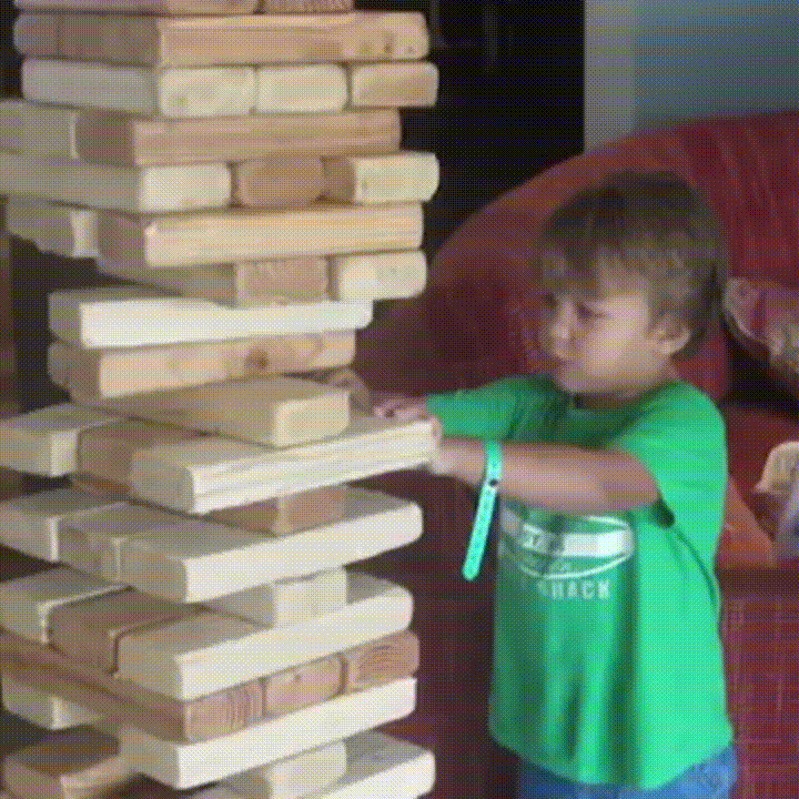
The first thing we could see straight away was that it was really hard to get a grasp on the whole process. The team’s approach had evolved over years of use and had become a kind of Jenga tower spreadsheet of columns and rows that were near impossible to navigate and full of things that people didn’t even know what they were for. The spreadsheet was actually so large that it took at least a minute to load.
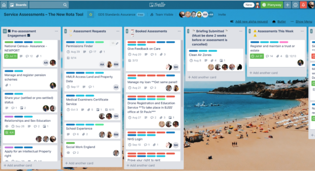
After sitting with the team and understanding their needs, we decided to test using Trello, a popular project management tool designed to help teams see what each other is working on, as a replacement for managing assessments. The team members were well aware of the problems with their massive spreadsheet but were hesitant to stop using it because they were used to it.
So we had to wear 2 hats:
- a user-centred design mindset, doing research sessions with the team while iterating the Trello board’s design and being open to the idea that it might not even be the right tool
- a change management mindset, selling the benefits of switching to Trello and helping the team get comfortable with the idea of moving to something different
Managing assessments
One problem this new tool solved was that it used to be very hard to get a grasp of where services were in the assurance cycle. This is very important for other teams in GDS who also support services and need to work with the assurance team. So we mapped out the different stages and plotted each stage of the process onto Trello, using lists (columns in Trello), and used cards for each service being assessed.
Publishing reports
Another issue was that the team spent so much time trying to use the old spreadsheet they had no time to publish reports created after assessments. These reports were always supposed to be one of the ways we make things open to make them better, but there was a backlog of unpublished reports going back years. Once the team got used to this more visible way of working, they were able to ensure that the whole process was followed and reports started being published again on GOV.UK. This was a massive success for us, and pretty much a casebook example of the benefits of visible working – a key agile principle.
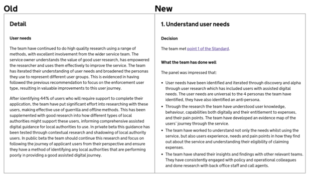
Around this time, we also iterated the format of the assessment report. The new format is more focused around each point of the Standard, giving assessors bullet points to fill in under each point rather than free text fields. This resulted in reports that are much easier to read and digest.
It was interesting to realise that this had probably affected how many people read the reports, which would have, in turn, affected how important it seemed to get them published, which of course meant the page was out of date meaning people weren’t reading them. A chicken and egg situation.
Tracking service progress
Another massive benefit of moving the team over to Trello was that they could more easily keep track of a team’s progress through multiple stages of development by reusing the same card. So, for example, when a team comes for their alpha assessment, the corresponding card gets taken through all the stages of the Trello board until the report is published. Then, when the service comes back for beta, the assessments team moves the card back to the start of the board to book their assessment. For the first time, the team is able to easily see the whole engagement history with each service.
We also realised that having Trello as a common tool across GDS and wider government is a massive boon for collaborative working. Because of Trello’s feature of linking cards, we can link our information about a service with the information that another team is holding about a service. For example, the GOV.UK step-by-step team uses Trello, so we can link their card about ‘Learn to drive’, for example, with our card about ‘Apply for a driving license’.
You can see a copy of the Trello board here, which your department’s assurance team is free to use.
Fixing the rules
Making sure the team had tools that were fit for the job was an essential first step, but we also needed to think about where the rules of the process were creating problems, and change them.
We saw that there was actually around a 3-month wait time to book an assessment, and the primary reason for this was that we simply didn’t have the rooms to host assessments in. We’ve tried a few things to solve this, but what we’ve landed on is asking teams to provide a room in their own department.
This has the added benefit of teams not having to travel. Lots of our assessors are already based around the country, it’s just that we often don’t target our assessor recruitment based on the location of assessments (because at the moment they’re usually in London).
Other subsequent benefits may include cost savings, where local assessors assess local services and therefore reduce travel costs, a reduced impact on the environment and potentially allowing us to run more frequent assessments if we can get better access to appropriate rooms.
We’re working on changing this now by keeping records of where assessors are able to travel to and aiming to recruit more from the places we need them most.
Fixing the headcount
Another thing that helped to solve these problems is in some ways even more obvious. We simply needed more people to manage the assessments process. It’s a solution that sometimes gets overlooked when we’re thinking about improving a process these days, as digitising and automation seem like the more exciting option, but sometimes it’s worth admitting that although those things can help, we often just need more people on the job.
Fixing the measure of success
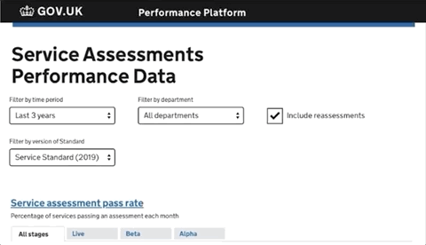
Our next step with this stream of work is better use of data. We can use data from a combination of our Trello board, Google calendar and the reports page to measure both how effective and efficient our team is, but even more importantly how well government is doing at meeting the Standard. We’ve mocked up a new dashboard showing the performance data we can now measure, and that allows us to really see the effect that improving the process has. We’ll be moving onto building and testing that next.
Fixing the basics in this way laid a vital foundation for getting service assessments ready for the updated Standard and even for thinking about developing assurance beyond the live phase. More on that in our next two blog posts.
If you would like to find out more about the updated service standard please get in touch via our mailing list.
Recent Comments