This text has been previously published on Medium.
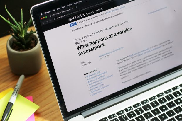
I’ve been involved with a lot of GOV.UK Service Standard assessments. For those that aren’t familiar with these assessments, they are checkpoints to make sure that new digital services in development for UK government meet certain standards across user research, design, technology, and ways of working.
The assessments are usually 4 hours, and the assessment panel have generally only been lightly briefed, so the team presenting their service has to cover a lot in the allotted time. The first part of the assessment is when the service team has 20–30 minutes to demonstrate (demo) the service.
When a team demos their service well, they:
- help the assessment panel understand what exactly the service is so that they can focus their questions
- reassure the panel that the team understands the full journey as well as the most important user journey that needs to work well
- save time for everyone by starting to give evidence about user research, design decisions, and analytics that can be built on in later parts of the assessment
However, I haven’t seen this happen very often. This may be in part because, while there is some guidance on the service manual, there are no detailed examples online on how to do this. So this is my advice to service teams on how to do a good demo based on my experience. This advice is also potentially of use to anyone who has demoed a service minimum viable product (MVP) to influential people.
Structuring a service demo
I’d suggest that a good service demo has the following sections:
- Background: scene-setting
- The cast: your users
- The lead (or leads): the primary user(s)
- The setup: how they get to the service
- The action: using the service
- The payoff: what happens next
Background
Ask yourself what the reason is that this service is even being worked on. Crafting a short (2 minute maximum) summary of the policy intent for your service helps everyone start from the same footing.
Depending on the reasons you’re working on your service, you may explain:
- the new or changed policy — if you’re working on a service because of a policy-related change
- the policy in general — if you’re replacing a legacy system
If your service is part of a bigger system then this may be a chance to show a map to help the panel understand where yours sits. Just remember that this is just the setup, you want to get to showing your service!
This is also a chance to mention the overarching user need before you switch from the context to the next section.
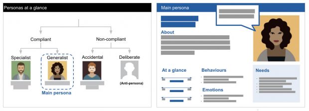
The cast
Show the different types of people using your service. It could be personas, behaviours, or user types — more than anything it’s about showing some breadth and giving a hint that you know who uses your service. It can be as simple as just showing an image, as you’ll have time to talk about this later.
The lead (or leads)
Introduce the person we’ll be following through today for the journey. Who are they? What is the lens that’s most useful to demonstrate the service?
On some services, this will be the most common journey. For example, for a service related to bereavement, the service manager chose the story of someone dealing with their mum’s fairly simple estate, since this was representative of most of their service users.
However, for others it may be a stress journey that is most important to get right. On a feedback-related service I assessed, the key journey was whistleblowing, as dealing with confidentiality for this user group would also benefit for other user types.
If you’re developing a system for both citizens and caseworkers, you may want to point out the 2 leads, but then only focus on the first person. You can then talk about the second person in more detail when they appear in the story.
The setup
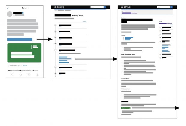
No one magically gets to a start page. What made your person need to interact with your service? How did they find out: did they get a leaflet, ring up, talk to someone or use a search engine?
Once you know what this journey will be, see if there are ways to show it rather than just talk about it. For example, I’ve mocked up proposed government emails and tweets, letter, and even search engine results. I’ve also altered existing guidance pages to show what it would look like if the service were live. Ideally you might even have these artefacts to hand if you’ve been doing user research on them.
If you have a lot of artefacts in different places it can be useful to have one person assigned to drive the demo, even if they’re not talking. Someone may need to have a prototype, live service, and other artefacts ready, and be comfortable with switching between them.
The action
How does your person use the service? What do they fill in and what don’t they fill in? This is an opportunity to bring data to life. For example, on one service, the user didn’t have to complete a complex section because they, like over 90% of people using the service, answered ‘no’ to a particular question.
I recommend getting your designers, user researcher and performance analyst together to agree the details of what you will and won’t show, and potentially create a shared crib sheet with all the details (for example, addresses, values and so on).
This may seem like a lot of work, but will make sure you use details that everyone feels are appropriate. On larger services it also means that whoever is showing screens can pre-empt the presenter if needed. For example, if the presenter says, “they add their address,” everyone will know that the person showing screens won’t accidentally put in a Scottish address that shows a ‘not eligible’ screen.
Deciding the details can help you understand when, rather than talking about how a user reacts to a particular screen, it is better to focus on what the team has done to create it. While you go through the journey, it is helpful to mention a couple of key details:
- choices your team has made
- issues raised by research and analytics that you've addressed
This may mean speeding through some parts of the service while doing so, or even skipping repeated actions. For example, with one service where the common journey meant a lot of sections answering ‘no’, the presenter was able to use the time while someone completed those fields to talk about putting these sections at the end, based on analytics showing that most people answered 'no'.
This technique is particularly useful for large or complex services where a few low-priority screens may not be as iterated as others. Adding details about what the team has done can also head off questions about screens that appear counterintuitive but are based on research.
The payoff
Just as the start page isn’t the start of a user’s journey, getting a confirmation page isn’t the end most of the time. What’s the actual end? On some services I’ve had to show a prototype of a confirmation page since we couldn’t use the developed service to show it, and I’ve also shown example emails and letters.
As mentioned earlier, for some service teams this may be the start of a second demo from the perspective of an internal user who processes the case. I haven’t seen this demonstrated much, let alone well, but would suggest considering starting a new story from this different lead user, though potentially with slightly less about finding the internal service - while they may need to have been trained and told about the service, that is too much to tell in one narrative and again can be talked about in more detail later.
Now… practice!
I strongly recommend that a team do at least one run through of their demo. This is a chance for the team to edit. In particular, be brutal about getting rid of exposition and tangents: there is time to show things like iterations and other user types in the respective sections.
The service manager for a service of potentially 200 screens did a successful demo in around 30 minutes. They did this partly by ruthlessly sticking to the common and simple journey, but also by cutting from the background section and letting some details come out in the action as needed.
Once you’ve done that, look for opportunities to make the actual service demo feel both realistic and a celebration of your hard work.
Note: Some of my suggestions on structure differ slightly from the service manual guidance for service assessments. This is possibly because my experience skews towards assessing complex and long services. In these scenarios, it’s critical to tell one story and then show others.