Building good services that meet user needs is an ongoing effort. User behaviours change, services grow in scope, and the environment around them evolves. Using both quantitative and qualitative data helps service teams make informed decisions about how to improve services on an ongoing basis.
When building services against the Service Standard, teams need to collect data against the 4 mandatory key performance indicators (KPIs). They also need to set and track service-specific KPIs to understand how well the service works for its users and make changes accordingly.
In this blog post, colleagues from across government share how they use service-specific KPIs to monitor, iterate and improve their service.
Self-Employment Income Support (HMRC)
Paul Cook, Performance Analyst
The Self-Employment Income Support Scheme (SEISS) was set up in spring 2020 to provide a grant for self-employed people, or members of a self-employed partnership, that have lost a lot of profit because of coronavirus (COVID-19).
I have been part of the SEISS team from the inception of the project in order to ensure key data and metrics are available to understand the end-to-end user journey.
At the beginning, it was both daunting and exciting knowing that dashboard data would be used in the daily briefings and discussed in the news!
I used the standard KPIs as a starting point to develop richer indicators of success. For example, on completion rate, the question of ‘how many who started their grant submission got to the confirmation page’, led to the formation of service-specific KPIs like:
- percentage of people that completed their grant submission who then received payment
- average time taken for a user to receive their payment
- proportion of grant submissions that were rejected due to fraud or error
- click-through rates for each grant submission page
- average time to complete the online journey
Some of the most important performance indicators we looked at helped us to understand how users behaved before they started their grant submission. Alongside user research findings, the design and content were iterated on following analysis of metrics like:
- click-through rates on GOV.UK content
- dwell time on content relating to eligibility
- page time-out analysis (what pages were viewed before a time-out occurred)
When trying to measure these effects it was important to view the data not just as a positive, or sometimes negative, arrow on a dashboard, but also as an indicator of how quickly and easily the user got their much-needed grant. Teaming up with our user researcher and analysing social media and survey comments helped put these KPIs into perspective.
GOV.UK Pay (Government Digital Service)
Christopher Brown, Performance Analyst
GOV.UK Pay, part of Government as a Platform, is a simple way for public sector teams to take and manage payments online, and for users to pay online. The service provides millions in benefits by making it easier for teams to integrate payments into their digital service or to take payments without any technical knowledge.
There are a range of metrics that help define how GOV.UK Pay is working and what success looks like for the team. Initially these were focused on transaction volume and number of services. A robust economic model is also regularly assessed with the economists.
As the service has grown, additional factors have been considered to reflect more accurately how GOV.UK Pay is performing. We decided on KPIs, as a team, based on what would be able to accurately measure value and growth, and we revisit these decisions on a regular basis. The extended KPIs focus more on measuring value for public sector users, and end users, rather than just showing increasing numbers.
For example, some of the KPIs we’ve considered and used include:
- how many services have taken a payment in a month
- how many services haven’t taken a payment in a few months and have maybe stopped using Pay
- number of users that see a technical error page
- time it takes to go from a test account to live and the ability for end users to pay
These KPIs also feed into quarterly objectives and key results (OKRs) that help to encourage change and help us monitor the effect of changes we make to the platform.
For example, GOV.UK Pay categorises and tags all tickets to our support desk, which helps us monitor how users are interacting with the service and spot problems. When we make changes to messaging, improve self-service, or how we onboard users, we can see what effect this has on the number and type of support queries we get.
Using tools such as Splunk, Google Analytics and our own database tool, Toolbox, we are able to track interactions with the service on a granular level. This means that any changes to the design and product can be fed back to the team in regular show and tells. This gives the whole team the confidence to make decisions, trial ideas, and know what’s working for users.
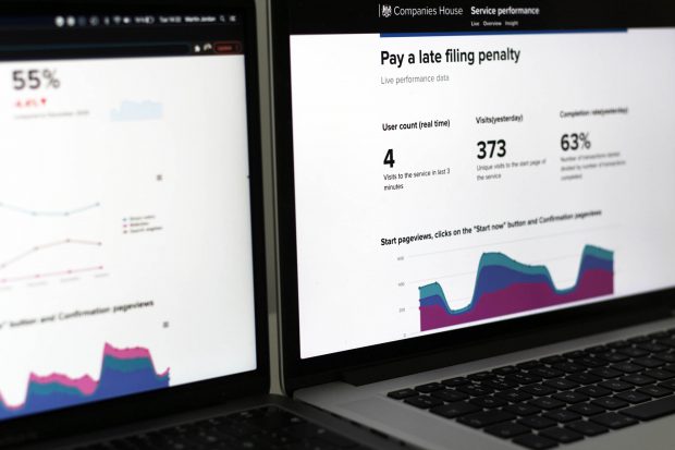
Pay a penalty for filing your accounts late service (Companies House)
Helen Hourihane, Head of Performance Analysis
As the Performance Analysis team, we are passionate about using data to understand our users better so we can deliver brilliant services. We are working on several exciting new beta services at Companies House. One of these is the “Pay a penalty for filing your accounts late” service.
The service is an accessible digital service that enables users to pay their penalty online, quickly, at any time of the day and without direct interaction with Companies House.
We held a workshop with the service team in the Discovery phase of the project to identify how we were going to measure the success of the service. We discussed the purpose of the service and the problem the service is looking to solve. We also looked at the service goals, benefits and user needs. From these discussions, we were able to design actionable, simple metrics that would allow users to effectively measure the performance of the service.
We summed up the service in a single line: Pay online quickly, no direct intervention, pay any time of day.
As well as the 4 mandatory KPIs we added:
- Completion time (average and mode)
- Direct intervention – number of user support calls
- Payments outside normal business hours
We always segment our data and compare the performance of our KPIs using these segments to understand all our users better. For example, our use of tracking links in our beta feedback surveys allows us to segment user satisfaction by user type and journey. As the average is a limited metric, we calculate both the mean and mode completion time.
That’s the KPIs identified, and we now know how we are going to collect the appropriate data. Once the service moves into private beta, we have a weekly performance review with the service team where we focus on the performance of the KPIs. We share what we have learnt from the data and discuss the insights.
These are often things that we might be expecting, and other times can be things we never would have predicted. We use the insights to develop hypotheses on how we can improve the service. We also evaluate the impact that any change has had on the KPIs to determine whether the service has improved for our users. The KPIs help us really understand and focus on service performance.
We also publish performance data of the service in real-time and overview online dashboards which the service team uses and anyone in Companies House can look at. Real-time dashboards enable us to be proactive and instantly see if there’s been a drop in the performance of a KPI and take immediate action.
Our monthly overview dashboards help us identify trends and correlations between the performance of the KPIs and user behaviour.
For example, we could clearly see that the completion rate was decreasing as more users were getting to the service from a search engine. We developed a hypothesis that this was because these types of users may not have the penalty reference number they need. Content was added to the start page to inform users they needed this reference. The completion rate improved as a result.
We also share our deeper analysis of the service in ‘insight’ dashboards. These dashboards tell the data story behind any changes in the KPIs and make tactical recommendations to improve performance.
We want these dashboards to spark conversations, enable action and inform decisions that will improve our services for our users. These dashboards from part of a Service Performance platform that collects together dashboards for all our beta services. They make the data easy to understand and create a shared view of the data. Service owners can also easily compare the performance of KPIs across the different services.
What are service-specific KPIs that your team has used to monitor, iterate and improve the service you’re working on? Do let us know in a comment below. And reach out to performance analysts from across government on Slack if you have questions or want support.
1 comment
Comment by John Mortimer posted on
KPIs are generally a product of a machine paradigm of how an organisation works. The KPIs are often blamed for generating strange behaviours in services, as staff react to the KPIs.
In progressive ways of working, the reality is that measures should be tied to customer value and what matters to them, and as such these are derived by those customers.
The second issue with KPIs is that they are often averaged over time. This assumes that an average figure will give a total performance over time. The reality is that poor results are blended in to good results, making it very difficult to then distinguish the problems and their causes.
The third thing is that managers believe KPIs and therefore use them as a proxy to actually going and finding out about the service in a real and direct way.
If I can use Universal Credit as an example. Most of the KPIs in UC look rosy, but the reality of the impact of the service of some many that I come across in local government tell completely the opposite story. There are people who simply do not use the service correctly and miss out on 2-3 months of benefits, plunging them into debt permanently. And there are others who find the whole thing so frustrating that they attempt to end their lives.
The biggest cause of council tax and social housing rent arrears is UC.
The KPIs do not show any of the above. So, although numbers can be helpful in highly transactional services, they are a serious diversion when GDS delves into more complex people based services.
If you search for the problems with KPIs you will find much published in the management literature over the last 25 years, as to their impact. They need to be designed very carefully, and used with even more caution. In my work, the first thing I do is to replace them with something far better.